Skip to content
替换为 Naive UI
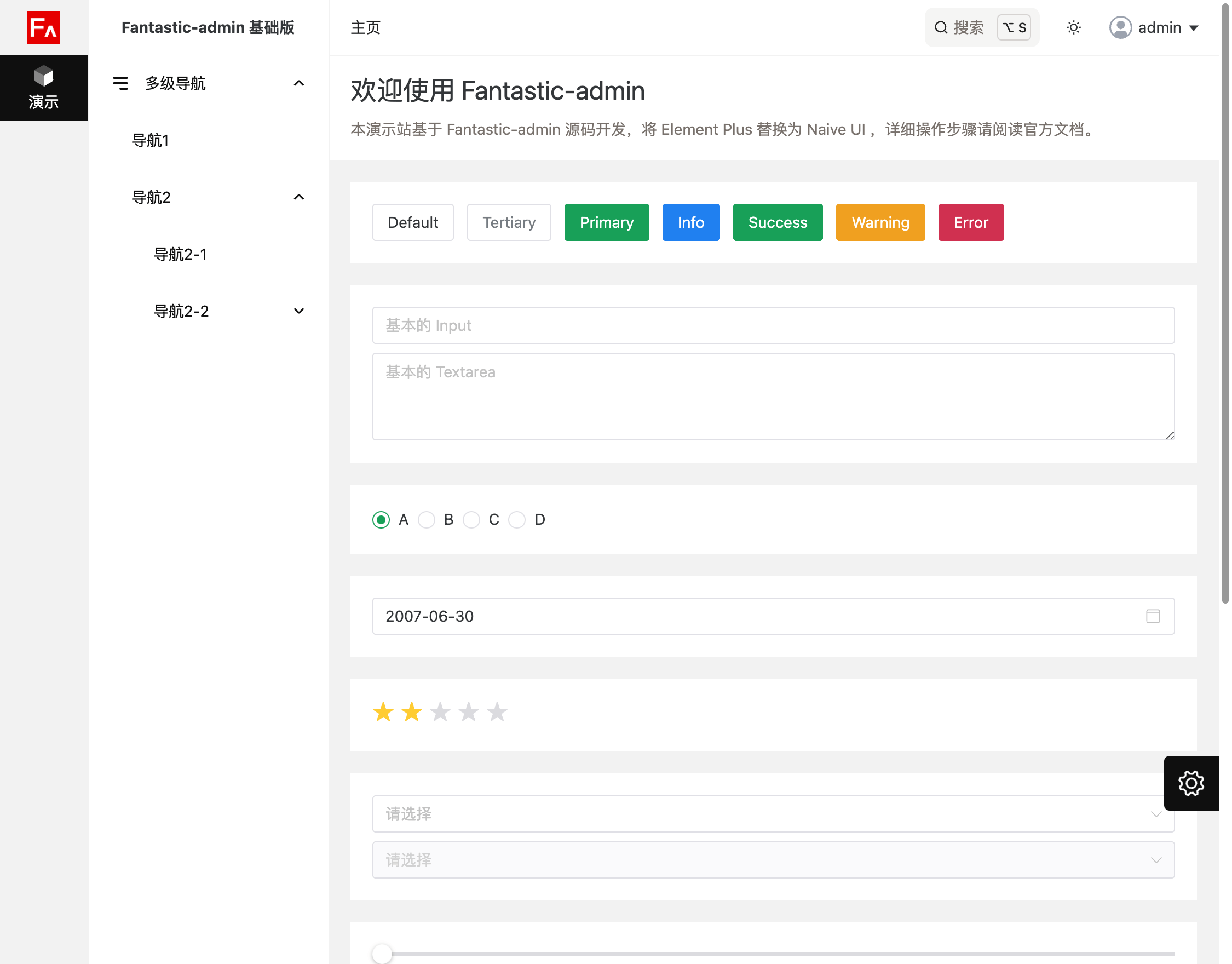
由于框架默认使用的是 Element Plus 组件库,并且演示源码中大量示例也使用了 Element Plus,如果你需要使用 Naive UI,请拉取框架源码分支,或者到 Github Releases 页面下载框架源码压缩包。
专业版用户也同样,请到专业版仓库下载框架源码。
安装
sh
# 安装依赖
pnpm install

# 安装 Naive UI
pnpm add naive-ui -D
代码调整
基础版
修改 /tsconfig.app.json 文件
json
{
  "compilerOptions": {
    ...
    "types": [
      ...
      "element-plus/global"
      "naive-ui/volar"
    ],
    ...
  }
}
整体修改 /src/ui/provider/index.ts 文件
ts
import type { App } from 'vue'
import naive from 'naive-ui'

function install(app: App) {
  app.use(naive)
}

export default { install }
整体修改 /src/ui/provider/index.vue 文件
vue
<script setup lang="ts">
import type { GlobalThemeOverrides } from 'naive-ui'
import { darkTheme, dateZhCN, zhCN } from 'naive-ui'

const settingsStore = useSettingsStore()

function hslToRgb(h: number, s: number, l: number) {
  h /= 360
  s /= 100
  l /= 100
  let r, g, b
  if (s === 0) {
    r = g = b = l // achromatic
  }
  else {
    const q = l < 0.5 ? l * (1 + s) : l + s - l * s
    const p = 2 * l - q
    r = hueToRgb(p, q, h + 1 / 3)
    g = hueToRgb(p, q, h)
    b = hueToRgb(p, q, h - 1 / 3)
  }
  return [Math.round(r * 255), Math.round(g * 255), Math.round(b * 255)]
}
function hueToRgb(p: number, q: number, t: number) {
  if (t < 0) {
    t += 1
  }
  if (t > 1) {
    t -= 1
  }
  if (t < 1 / 6) {
    return p + (q - p) * 6 * t
  }
  if (t < 1 / 2) {
    return q
  }
  if (t < 2 / 3) {
    return p + (q - p) * (2 / 3 - t) * 6
  }
  return p
}

const themeOverrides = ref<GlobalThemeOverrides>({
  common: {
    primaryColor: '',
    primaryColorHover: '',
  },
  Button: {
    textColor: '',
  },
})

watch([
  () => settingsStore.settings.app.colorScheme,
  () => settingsStore.settings.app.radius,
], () => {
  const rootStyles = getComputedStyle(document.documentElement)
  const primaryColor = hslToRgb(
    Number.parseFloat(rootStyles.getPropertyValue('--primary').split(' ')[0]),
    Number.parseFloat(rootStyles.getPropertyValue('--primary').split(' ')[1]),
    Number.parseFloat(rootStyles.getPropertyValue('--primary').split(' ')[2]),
  )
  const foregroundColor = hslToRgb(
    Number.parseFloat(rootStyles.getPropertyValue('--foreground').split(' ')[0]),
    Number.parseFloat(rootStyles.getPropertyValue('--foreground').split(' ')[1]),
    Number.parseFloat(rootStyles.getPropertyValue('--foreground').split(' ')[2]),
  )
  const backgroundColor = hslToRgb(
    Number.parseFloat(rootStyles.getPropertyValue('--background').split(' ')[0]),
    Number.parseFloat(rootStyles.getPropertyValue('--background').split(' ')[1]),
    Number.parseFloat(rootStyles.getPropertyValue('--background').split(' ')[2]),
  )
  themeOverrides.value = {
    common: {
      primaryColor: `rgb(${primaryColor.join(',')})`,
      primaryColorHover: `rgba(${primaryColor.join(',')},0.8)`,
      primaryColorPressed: `rgb(${primaryColor.join(',')})`,
      bodyColor: `rgb(${backgroundColor.join(',')})`,
      borderRadius: `${Number.parseFloat(rootStyles.getPropertyValue('--radius')) * 16}px`,
      borderRadiusSmall: `${Number.parseFloat(rootStyles.getPropertyValue('--radius')) * 12}px`,
    },
    Button: {
      textColor: `rgb(${foregroundColor.join(',')})`,
    },
  }
}, {
  immediate: true,
})
</script>

<template>
  <NConfigProvider :locale="zhCN" :date-locale="dateZhCN" :theme="settingsStore.currentColorScheme === 'dark' ? darkTheme : undefined" :theme-overrides="themeOverrides" style="height: 100%;">
    <NMessageProvider>
      <slot />
      <NGlobalStyle />
    </NMessageProvider>
  </NConfigProvider>
</template>
专业版
修改 /tsconfig.app.json 文件
json
{
  "compilerOptions": {
    ...
    "types": [
      ...
      "element-plus/global"
      "naive-ui/volar"
    ],
    ...
  }
}
整体修改 /src/ui/provider/index.ts 文件
ts
import type { App } from 'vue'
import naive, { dateEnUS, dateZhCN, dateZhTW, enUS, zhCN, zhTW } from 'naive-ui'

function install(app: App) {
  app.use(naive)
}

// 此处的对象属性和 src/locales/index.ts 中的 messages 对象属性一一对应
const locales: Record<string, any> = {
  'zh-cn': {
    ui: zhCN,
    date: dateZhCN,
  },
  'zh-tw': {
    ui: zhTW,
    date: dateZhTW,
  },
  'en': {
    ui: enUS,
    date: dateEnUS,
  },
}

export default { install }
export { locales }
整体修改 /src/ui/provider/index.vue 文件
vue
<script setup lang="ts">
import type { GlobalThemeOverrides } from 'naive-ui'
import { darkTheme } from 'naive-ui'
import { locales } from './index'

const settingsStore = useSettingsStore()

function hslToRgb(h: number, s: number, l: number) {
  h /= 360
  s /= 100
  l /= 100
  let r, g, b
  if (s === 0) {
    r = g = b = l // achromatic
  }
  else {
    const q = l < 0.5 ? l * (1 + s) : l + s - l * s
    const p = 2 * l - q
    r = hueToRgb(p, q, h + 1 / 3)
    g = hueToRgb(p, q, h)
    b = hueToRgb(p, q, h - 1 / 3)
  }
  return [Math.round(r * 255), Math.round(g * 255), Math.round(b * 255)]
}
function hueToRgb(p: number, q: number, t: number) {
  if (t < 0) {
    t += 1
  }
  if (t > 1) {
    t -= 1
  }
  if (t < 1 / 6) {
    return p + (q - p) * 6 * t
  }
  if (t < 1 / 2) {
    return q
  }
  if (t < 2 / 3) {
    return p + (q - p) * (2 / 3 - t) * 6
  }
  return p
}

const themeOverrides = ref<GlobalThemeOverrides>({
  common: {
    primaryColor: '',
    primaryColorHover: '',
  },
  Button: {
    textColor: '',
  },
})

watch([
  () => settingsStore.settings.app.colorScheme,
  () => settingsStore.settings.app.lightTheme,
  () => settingsStore.settings.app.darkTheme,
  () => settingsStore.settings.app.themeSync,
  () => settingsStore.settings.app.radius,
], () => {
  const rootStyles = getComputedStyle(document.body)
  const primaryColor = hslToRgb(
    Number.parseFloat(rootStyles.getPropertyValue('--primary').split(' ')[0]),
    Number.parseFloat(rootStyles.getPropertyValue('--primary').split(' ')[1]),
    Number.parseFloat(rootStyles.getPropertyValue('--primary').split(' ')[2]),
  )
  const foregroundColor = hslToRgb(
    Number.parseFloat(rootStyles.getPropertyValue('--foreground').split(' ')[0]),
    Number.parseFloat(rootStyles.getPropertyValue('--foreground').split(' ')[1]),
    Number.parseFloat(rootStyles.getPropertyValue('--foreground').split(' ')[2]),
  )
  const backgroundColor = hslToRgb(
    Number.parseFloat(rootStyles.getPropertyValue('--background').split(' ')[0]),
    Number.parseFloat(rootStyles.getPropertyValue('--background').split(' ')[1]),
    Number.parseFloat(rootStyles.getPropertyValue('--background').split(' ')[2]),
  )
  themeOverrides.value = {
    common: {
      primaryColor: `rgb(${primaryColor.join(',')})`,
      primaryColorHover: `rgba(${primaryColor.join(',')},0.8)`,
      primaryColorPressed: `rgb(${primaryColor.join(',')})`,
      bodyColor: `rgb(${backgroundColor.join(',')})`,
      borderRadius: `${Number.parseFloat(rootStyles.getPropertyValue('--radius')) * 16}px`,
      borderRadiusSmall: `${Number.parseFloat(rootStyles.getPropertyValue('--radius')) * 12}px`,
    },
    Button: {
      textColor: `rgb(${foregroundColor.join(',')})`,
    },
  }
}, {
  immediate: true,
})
</script>

<template>
  <NConfigProvider :locale="locales[settingsStore.lang].ui" :date-locale="locales[settingsStore.lang].date" :theme="settingsStore.currentColorScheme === 'dark' ? darkTheme : undefined" :theme-overrides="themeOverrides" style="height: 100%;">
    <NMessageProvider>
      <slot />
      <NGlobalStyle />
    </NMessageProvider>
  </NConfigProvider>
</template>
删除相关文件
.
├─ plop-templates
│  └─ module // 标准模块模板基于 Element Plus 开发,需要删除
└─ src
   └─ components // 下列扩展组件基于 Element Plus 二次封装,需要删除
     └─ PcasCascader
卸载
sh
# 卸载 Element Plus
pnpm remove element-plus
完成
至此,你已经将框架中的 Element Plus 组件库替换为 Naive UI 组件库,并且可以开始使用 Naive UI 进行业务开发了。
示例
如果对上述的步骤还有不清楚的地方,可以访问此仓库查看示例源码,以及此链接查看示例网站。